


Configure navigation for a report – Visualize and analyze the data
Configure navigation for a report Besides using the page bar for navigation in the report, you can configure page or bookmark navigators, which work similarly to buttons or slicers. To add a page or button navigator to the canvas, select…

Configure sync slicers – Visualize and analyze the data
Configure sync slicers Report-level filters, which we reviewed earlier in this chapter, can be useful when a filter is applicable to every page, whereas page-level filters are appropriate for page-specific filters. Sometimes there are filters that apply to more than…

Group and layer visuals by using the Selection pane – Visualize and analyze the data
Group and layer visuals by using the Selection pane The Selection pane allows you to control the visibility of visuals. To open the pane, select View > Selection. In the pane, you’ll see a list of visuals on the current…

Drill down into data using interactive visuals – Visualize and analyze the data
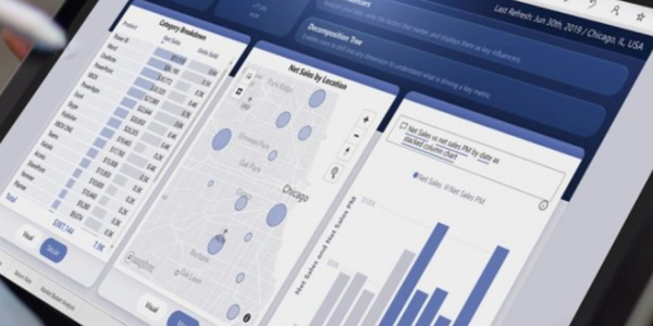
Drill down into data using interactive visuals Many visuals allow you to explore data interactively when you use several levels of fields—for example, Year, Quarter, and Month columns on the x-axis in a line chart. Whether you use a hierarchy…
Design reports for mobile devices – Visualize and analyze the data
Design reports for mobile devices We reviewed mobile views for dashboards earlier in the chapter. Similar to how you work with dashboards, you can create separate views of your report to optimize the experience for smaller screens. In this section,…

Identify patterns and trends – Visualize and analyze the data
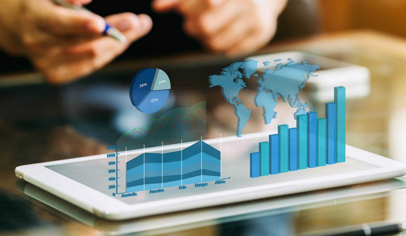
Skill 3.4: Identify patterns and trends When you visualize data, you’ll often need to apply some enhancements to your visuals or reports to highlight insights in your data. You can enhance your analysis by employing advanced algorithms built into Power…

Identify outliers – Visualize and analyze the data
Identify outliers When a data point is not in the expected range, it’s called an outlier. Identifying outliers can be useful because they may happen for a variety of reasons, which you may often want to investigate. For example, a…

Use groupings, binnings, and clustering – Visualize and analyze the data
Use groupings, binnings, and clustering In addition to data clustering, you can perform grouping and binning of columns in Power BI to bring together data with business logic and higher-level data analysis. Grouping Grouping allows you to manually group values…

Binning – Visualize and analyze the data
Binning When you work with categorical values, you can only create groups of type List. When you work with numeric or date/time columns, you can also create bins, which may be more appropriate when there are too many values to…